TimeWise
This app will change how you view time.
OVERVIEW
TimeWise is a conceptual time management app that reimagines productivity by helping users track their time like a budget. Its goal is to reduce the friction of planning by using intuitive design, personalization, and behavioral insight. The app prioritizes simplicity—because saving time shouldn’t take time.
Mobile App
My Role
Lead designer, UX Designer
Year
2023
Tools
Figma

The Challenge
This is the Challenge Statement
Here is more details about the challenge for your reference. I am now talking so much more about it as you can read All the work I’ve done so Far has lead up to this explanation of the challenge. As you keep reading I will go through the process.
The Solution
This is the Solution Statement
Here is more details about the challenge for your reference. I am now talking so much more about it as you can read All the work I’ve done so Far has lead up to this explanation of the challenge. As you keep reading I will go through the process.
Feature 1
This is a description of this feature I’m Highlighting what this feature can do so you know what the app is here for.
Feature 2
This is a description of this feature I’m Highlighting what this feature can do so you know what the app is here for.
Feature 3
This is a description of this feature I’m Highlighting what this feature can do so you know what the app is here for.
The Dilemma
The Problem With Productivity
Time management tools often fail the very people they're designed to help.
Users are frustrated with time management apps that take too long to learn and even longer to trust. They're busy—and ironically, don’t have time for the tools meant to save it.

The Answer
Intuition Meets Intention
Design a system that simplifies time management through intuitive, customisable UX.
TimeWise simplifies the process of task planning through visual tools, clear UX language, and dynamic customisation. Users log how they spend their time, identify patterns, and improve day by day.

Visual Time Banking
Users manage their day like a budget, assigning "time credits" to each task.

Personalized Time Reports
Track how your time is spent with visual analytics and improvement suggestions.
Self-Guided Growth
Read curated content and habit tips to improve your time management daily.
The Dilemma
The Problem With Productivity
Time management tools often fail the very people they're designed to help.
Users are frustrated with time management apps that take too long to learn and even longer to trust. They're busy—and ironically, don’t have time for the tools meant to save it.
The Answer
Intuition Meets Intention
Design a system that simplifies time management through intuitive, customisable UX.
TimeWise simplifies the process of task planning through visual tools, clear UX language, and dynamic customisation. Users log how they spend their time, identify patterns, and improve day by day.
Visual Time Banking
Users manage their day like a budget, assigning "time credits" to each task.
Personalized Time Reports
Track how your time is spent with visual analytics and improvement suggestions.
Self-Guided Growth
Read curated content and habit tips to improve your time management daily.
The Challenge
This is the Challenge Statement
Here is more details about the challenge for your reference. I am now talking so much more about it as you can read All the work I’ve done so Far has lead up to this explanation of the challenge. As you keep reading I will go through the process.
The Solution
This is the Solution Statement
Here is more details about the challenge for your reference. I am now talking so much more about it as you can read All the work I’ve done so Far has lead up to this explanation of the challenge. As you keep reading I will go through the process.
Feature 1
This is a description of this feature I’m Highlighting what this feature can do so you know what the app is here for.
Feature 2
This is a description of this feature I’m Highlighting what this feature can do so you know what the app is here for.
Feature 3
This is a description of this feature I’m Highlighting what this feature can do so you know what the app is here for.
The Dilemma
The Problem With Productivity
Time management tools often fail the very people they're designed to help.
Users are frustrated with time management apps that take too long to learn and even longer to trust. They're busy—and ironically, don’t have time for the tools meant to save it.
The Answer
Intuition Meets Intention
Design a system that simplifies time management through intuitive, customisable UX.
TimeWise simplifies the process of task planning through visual tools, clear UX language, and dynamic customisation. Users log how they spend their time, identify patterns, and improve day by day.
Visual Time Banking
Users manage their day like a budget, assigning "time credits" to each task.
Personalized Time Reports
Track how your time is spent with visual analytics and improvement suggestions.
Self-Guided Growth
Read curated content and habit tips to improve your time management daily.
From Prototype to Possibility
Making TimeWise real—and making it usable
Time You Can Actually Use


Create and Set Schedules
Visualize and assign tasks, schedules, and reminders with ease.
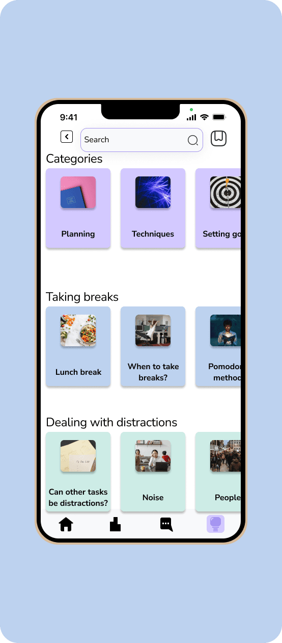
Gain Valuable Knowledge
Learn tips and tricks for magaging time and balancing health all in one place.


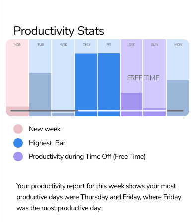
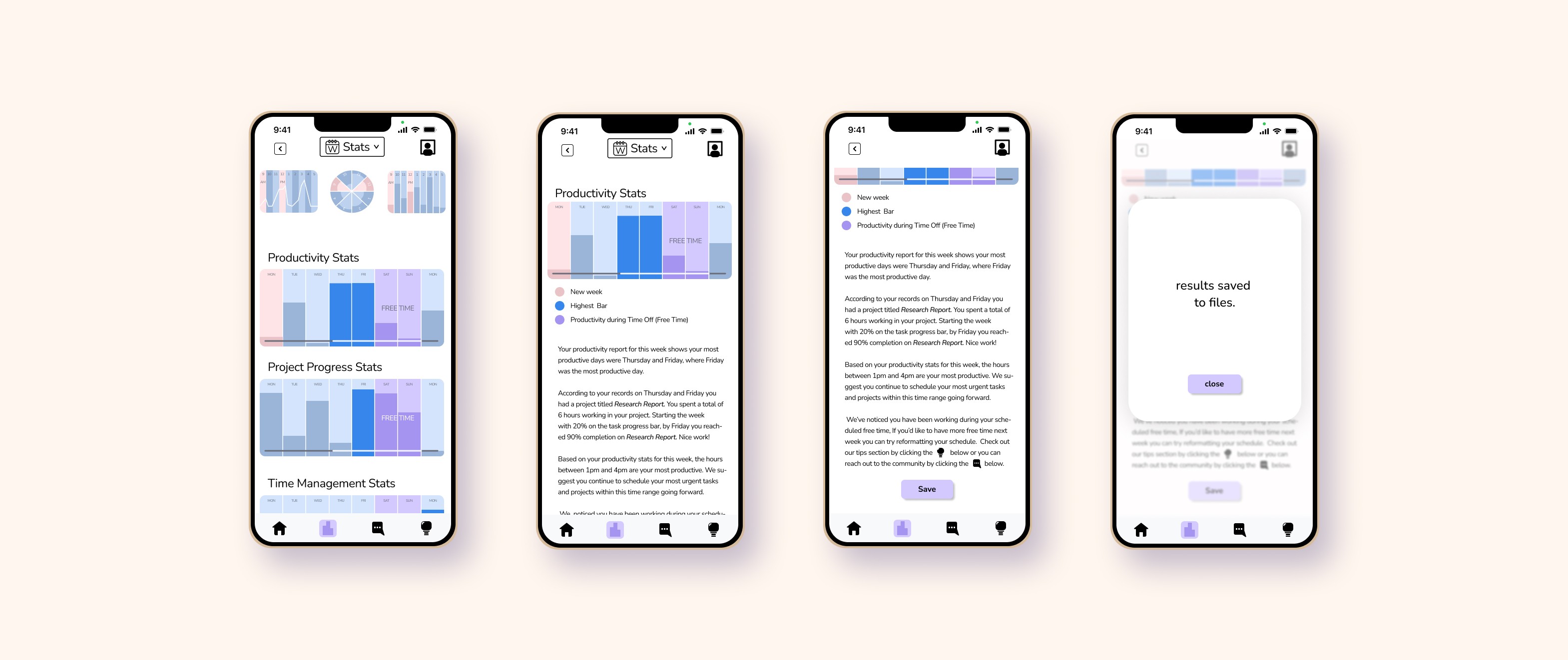
Stats with Clarity
View comprhensive breakdowns of how you’ve spent time over the week, month, or year.
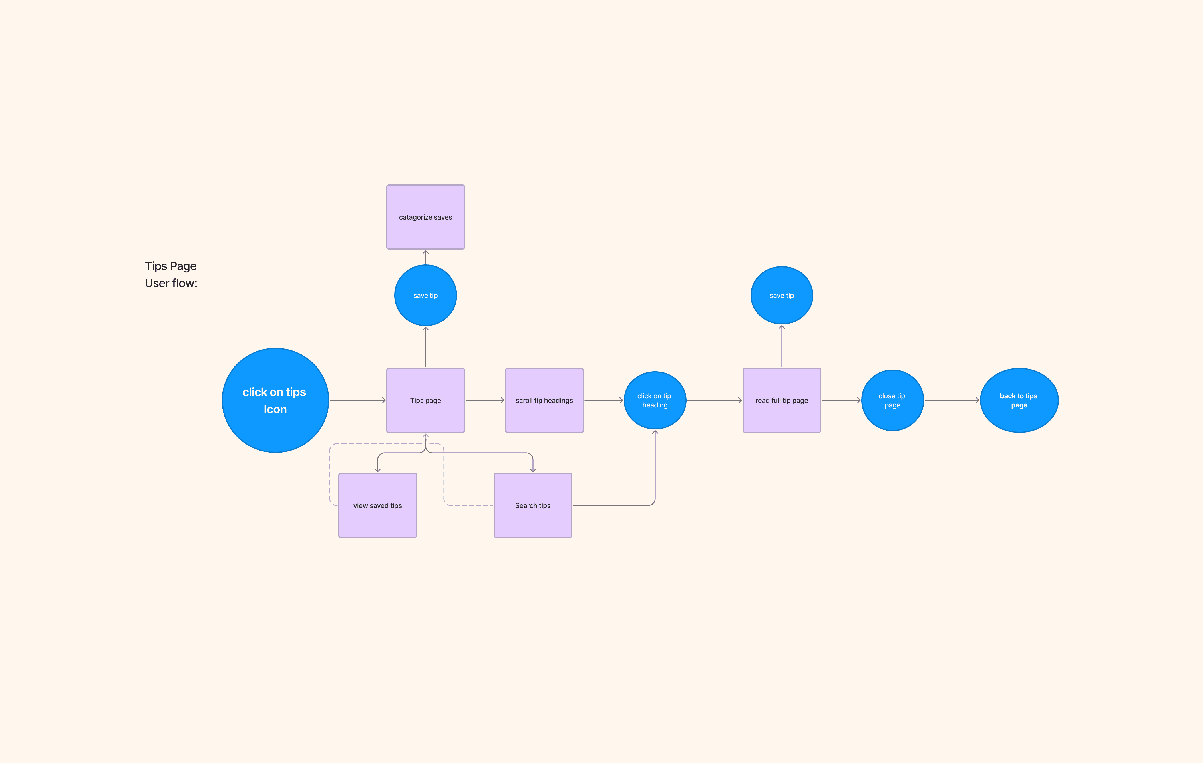
User Flow
From day planning to report viewing and self-reflection, every flow was designed to minimize friction and maximize insight.
Lo-fi Sketches
Before building screens, we mapped out flows with quick sketches to visualize structure and hierarchy.

Branding: The TimeWise Aesthetic
Our system uses crisp typography, subtle gradients, and intuitive iconography to support a focused, modern feel.
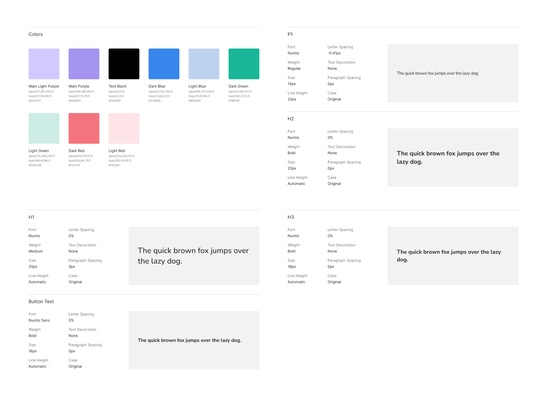
Components
We built reusable components that streamlined design updates and ensured layout consistency.

Usability Test
What Worked
Clear placeholder text and linear task flows led to high success in form completion.
Needs Work
Users were unclear on how tasks differed from timed blocks.
Questions
Do users want fixed or fluid scheduling tools?
Ideas
Introduce a toggle for flexible vs structured planning styles.
Design Constraints: Limited Real-World Validation
TimeWise was developed conceptually without user testing, meaning its design was grounded in research insights rather than hands-on iterations.

Design Constraints: Feature Scope Creep
Early brainstorming generated a wide array of features, but many had to be cut to preserve the app's core simplicity and focus on time-as-currency metaphors.
Design Constraints: Balancing Customization and Usability
Personalization was key to making the app useful for a range of user types, but too many options risked overwhelming users—the design had to walk a careful line between flexibility and cognitive load.

From Prototype to Possibility
Making TimeWise real—and making it usable
Time You Can Actually Use
Create and Set Schedules
Visualize and assign tasks, schedules, and reminders with ease.
Gain Valuable Knowledge
Learn tips and tricks for magaging time and balancing health all in one place.
Stats with Clarity
View comprhensive breakdowns of how you’ve spent time over the week, month, or year.
User Flow
From day planning to report viewing and self-reflection, every flow was designed to minimize friction and maximize insight.
Lo-fi Sketches
Before building screens, we mapped out flows with quick sketches to visualize structure and hierarchy.
Branding: The TimeWise Aesthetic
Our system uses crisp typography, subtle gradients, and intuitive iconography to support a focused, modern feel.
Components
We built reusable components that streamlined design updates and ensured layout consistency.
Usability Test
What Worked
Clear placeholder text and linear task flows led to high success in form completion.
Needs Work
Users were unclear on how tasks differed from timed blocks.
Questions
Do users want fixed or fluid scheduling tools?
Ideas
Introduce a toggle for flexible vs structured planning styles.
Design Constraints: Limited Real-World Validation
TimeWise was developed conceptually without user testing, meaning its design was grounded in research insights rather than hands-on iterations.
Design Constraints: Feature Scope Creep
Early brainstorming generated a wide array of features, but many had to be cut to preserve the app's core simplicity and focus on time-as-currency metaphors.
Design Constraints: Balancing Customization and Usability
Personalization was key to making the app useful for a range of user types, but too many options risked overwhelming users—the design had to walk a careful line between flexibility and cognitive load.
Digging Deeper
Why do so many time management tools waste time; and how can we flip the script?

Users Don’t Have Time to Learn How to Save Time

The biggest frustration users have with time management apps is ironically… the time it takes to use them. Users want help managing their day, not an onboarding process that becomes its own chore. Many complained about confusing language, overwhelming features, and cluttered layouts; barriers that stop them from using these tools consistently.
How can we design an app that teaches time management without requiring users to learn how to use it?
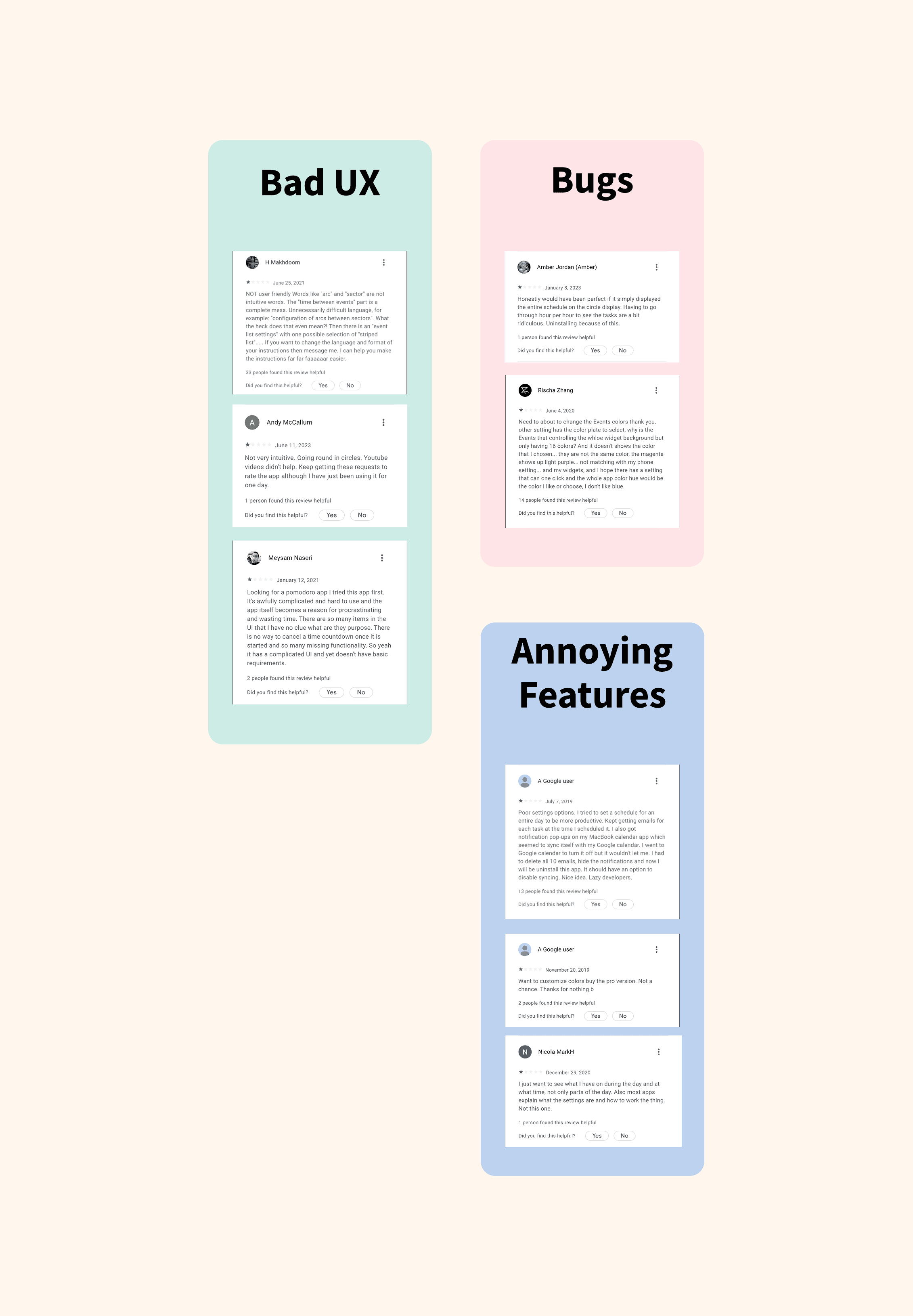
Raw Data Analysis: Letting the Comments Speak
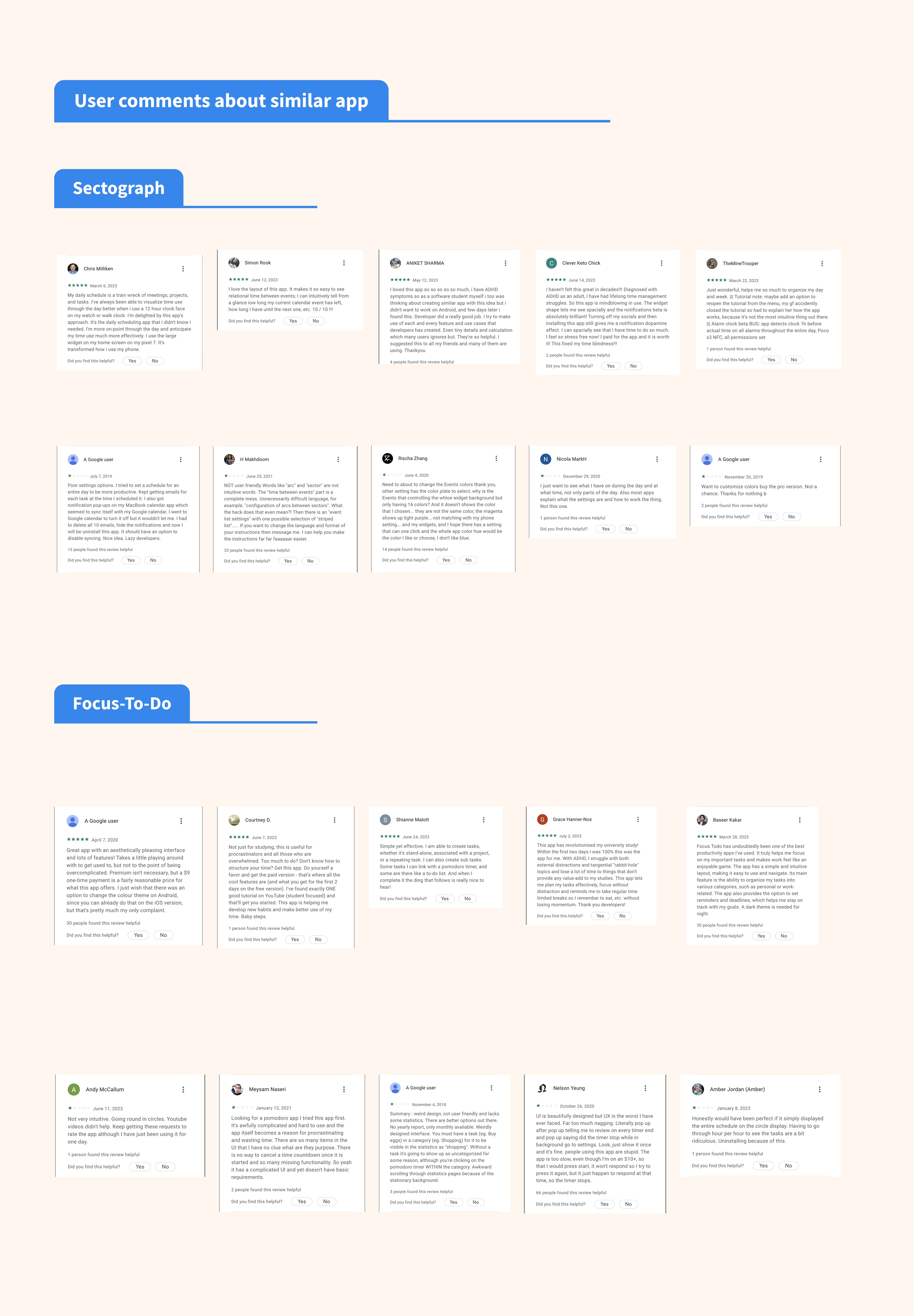
We began by diving into user comments on existing time management apps. Our goal? To identify recurring frustrations and must-have features. Positive reviews helped highlight what users value, while complaints revealed key pain points.
This process taught us that users don’t just want a tracker—they want a teacher. Apps that required tutorials or complex onboarding were tossed aside. Simplicity wasn’t just a preference—it was a demand.
Problem Statements: Giving Users a Clear Voice

We categorised user complaints into themes and translated them into clear, actionable problem statements that would guide ideation.
This made the user needs feel actionable and focused our team on solving real problems instead of chasing features.
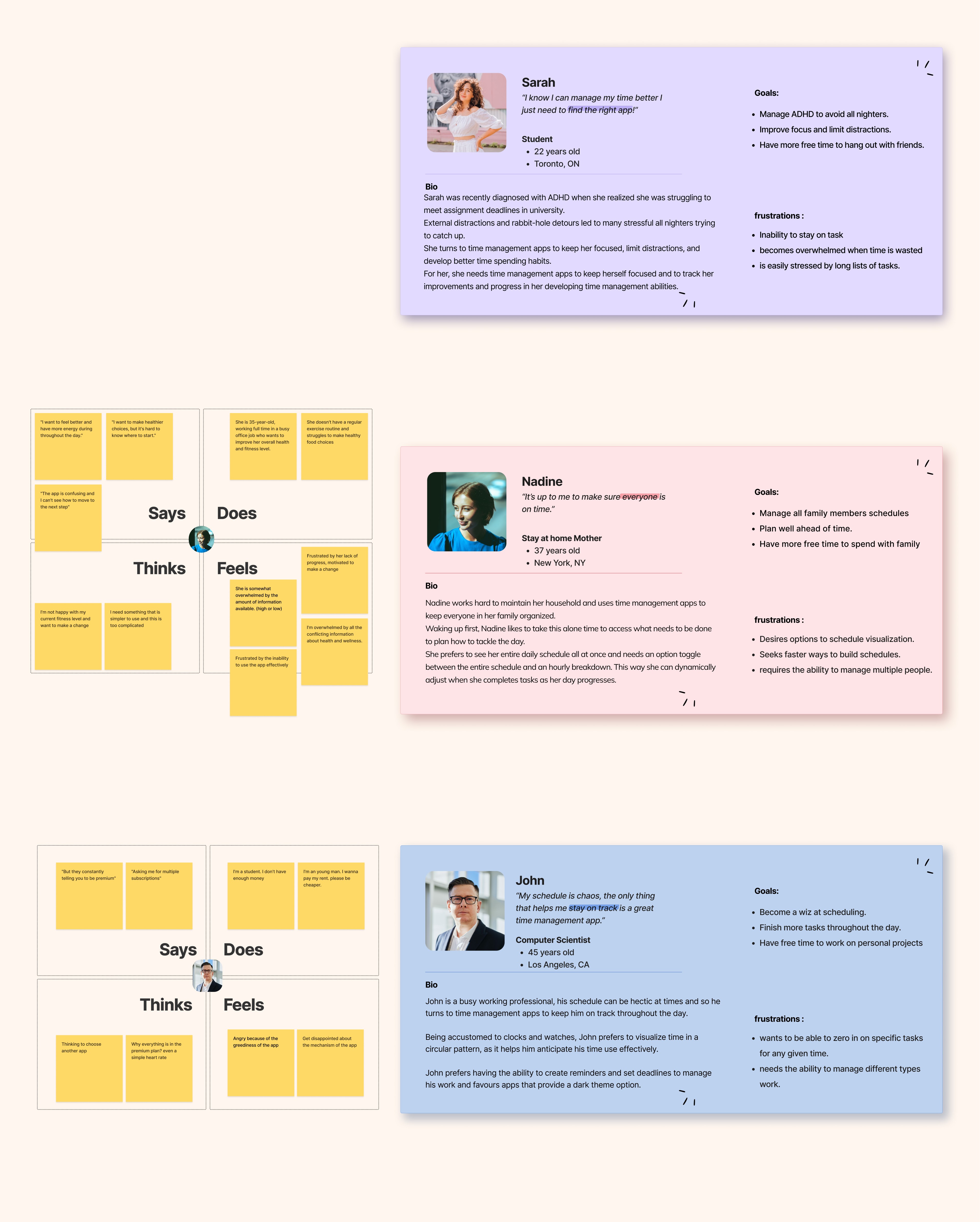
Empathy Mapping & Personas: Meeting the Humans Behind the Data
Empathy maps and personas were created based on segmented user complaints. These helped visualise different types of users, their contexts, and their emotional states.
Developing Sarah, Nadine, and John made it easier to design with empathy and precision.
Digging Deeper
Why do so many time management tools waste time; and how can we flip the script?
Users Don’t Have Time to Learn How to Save Time
The biggest frustration users have with time management apps is ironically… the time it takes to use them. Users want help managing their day, not an onboarding process that becomes its own chore. Many complained about confusing language, overwhelming features, and cluttered layouts; barriers that stop them from using these tools consistently.
How can we design an app that teaches time management without requiring users to learn how to use it?
Raw Data Analysis: Letting the Comments Speak
We began by diving into user comments on existing time management apps. Our goal? To identify recurring frustrations and must-have features. Positive reviews helped highlight what users value, while complaints revealed key pain points.
This process taught us that users don’t just want a tracker—they want a teacher. Apps that required tutorials or complex onboarding were tossed aside. Simplicity wasn’t just a preference—it was a demand.
Problem Statements: Giving Users a Clear Voice
We categorised user complaints into themes and translated them into clear, actionable problem statements that would guide ideation.
This made the user needs feel actionable and focused our team on solving real problems instead of chasing features.
Empathy Mapping & Personas: Meeting the Humans Behind the Data
Empathy maps and personas were created based on segmented user complaints. These helped visualise different types of users, their contexts, and their emotional states.
Developing Sarah, Nadine, and John made it easier to design with empathy and precision.
01.Research Phase Title
Research Question goes here what are you trying to uncover?
Main discovery title
This is a description of the discovery. It explains the key finding and what lead to the discovery. This should only be a few lines don’t make it too heavy and full of text you just want to matter of factly explain what it is. It is nice to describe statistics here and pair with an infographic of the stat.
Now that we’ve discovered this main thing we now have a new question that seeks to understand how users feel about this discovery.
Empathizing: Activity 1
This is a description of the first activity that was done to discover the user needs. Talk about what you did.
This is where you reflect on what you discovered and describe something interesting that you figured out during the process.
Empathizing: Activity 2
This is a description of the first activity that was done to discover the user needs. Talk about what you did.
This is where you reflect on what you discovered and describe something interesting that you figured out during the process.
Empathizing: Activity 3
This is a description of the first activity that was done to discover the user needs. Talk about what you did.
This is where you reflect on what you discovered and describe something interesting that you figured out during the process.
Digging Deeper
Why do so many time management tools waste time; and how can we flip the script?
Users Don’t Have Time to Learn How to Save Time
The biggest frustration users have with time management apps is ironically… the time it takes to use them. Users want help managing their day, not an onboarding process that becomes its own chore. Many complained about confusing language, overwhelming features, and cluttered layouts; barriers that stop them from using these tools consistently.
How can we design an app that teaches time management without requiring users to learn how to use it?
Raw Data Analysis: Letting the Comments Speak
We began by diving into user comments on existing time management apps. Our goal? To identify recurring frustrations and must-have features. Positive reviews helped highlight what users value, while complaints revealed key pain points.
This process taught us that users don’t just want a tracker—they want a teacher. Apps that required tutorials or complex onboarding were tossed aside. Simplicity wasn’t just a preference—it was a demand.
Problem Statements: Giving Users a Clear Voice
We categorised user complaints into themes and translated them into clear, actionable problem statements that would guide ideation.
This reinforced the idea that less is more when it comes to UX.
Empathy Mapping & Personas: Meeting the Humans Behind the Data
We mapped out critical flows for onboarding, scheduling tasks, and reviewing time-spending patterns.
These flows helped us see friction points and made the ideal paths obvious.
01.Research Phase Title
Research Question goes here what are you trying to uncover?
Main discovery title
This is a description of the discovery. It explains the key finding and what lead to the discovery. This should only be a few lines don’t make it too heavy and full of text you just want to matter of factly explain what it is. It is nice to describe statistics here and pair with an infographic of the stat.
Now that we’ve discovered this main thing we now have a new question that seeks to understand how users feel about this discovery.
Empathizing: Activity 1
This is a description of the first activity that was done to discover the user needs. Talk about what you did.
This is where you reflect on what you discovered and describe something interesting that you figured out during the process.
Empathizing: Activity 2
This is a description of the first activity that was done to discover the user needs. Talk about what you did.
This is where you reflect on what you discovered and describe something interesting that you figured out during the process.
Empathizing: Activity 3
This is a description of the first activity that was done to discover the user needs. Talk about what you did.
This is where you reflect on what you discovered and describe something interesting that you figured out during the process.
Digging Deeper
Why do so many time management tools waste time; and how can we flip the script?
Users Don’t Have Time to Learn How to Save Time
The biggest frustration users have with time management apps is ironically… the time it takes to use them. Users want help managing their day, not an onboarding process that becomes its own chore. Many complained about confusing language, overwhelming features, and cluttered layouts; barriers that stop them from using these tools consistently.
How can we design an app that teaches time management without requiring users to learn how to use it?
Raw Data Analysis: Letting the Comments Speak
We began by diving into user comments on existing time management apps. Our goal? To identify recurring frustrations and must-have features. Positive reviews helped highlight what users value, while complaints revealed key pain points.
This process taught us that users don’t just want a tracker—they want a teacher. Apps that required tutorials or complex onboarding were tossed aside. Simplicity wasn’t just a preference—it was a demand.
Problem Statements: Giving Users a Clear Voice
We categorised user complaints into themes and translated them into clear, actionable problem statements that would guide ideation.
This made the user needs feel actionable and focused our team on solving real problems instead of chasing features.
Empathy Mapping & Personas: Meeting the Humans Behind the Data
Empathy maps and personas were created based on segmented user complaints. These helped visualise different types of users, their contexts, and their emotional states.
Developing Sarah, Nadine, and John made it easier to design with empathy and precision.
01.Research Phase Title
Research Question goes here what are you trying to uncover?
Main discovery title
This is a description of the discovery. It explains the key finding and what lead to the discovery. This should only be a few lines don’t make it too heavy and full of text you just want to matter of factly explain what it is. It is nice to describe statistics here and pair with an infographic of the stat.
Now that we’ve discovered this main thing we now have a new question that seeks to understand how users feel about this discovery.
Empathizing: Activity 1
This is a description of the first activity that was done to discover the user needs. Talk about what you did.
This is where you reflect on what you discovered and describe something interesting that you figured out during the process.
Empathizing: Activity 2
This is a description of the first activity that was done to discover the user needs. Talk about what you did.
This is where you reflect on what you discovered and describe something interesting that you figured out during the process.
Empathizing: Activity 3
This is a description of the first activity that was done to discover the user needs. Talk about what you did.
This is where you reflect on what you discovered and describe something interesting that you figured out during the process.
Digging Deeper
Why do so many time management tools waste time; and how can we flip the script?
Users Don’t Have Time to Learn How to Save Time
The biggest frustration users have with time management apps is ironically… the time it takes to use them. Users want help managing their day, not an onboarding process that becomes its own chore. Many complained about confusing language, overwhelming features, and cluttered layouts; barriers that stop them from using these tools consistently.
How can we design an app that teaches time management without requiring users to learn how to use it?
Raw Data Analysis: Letting the Comments Speak
We began by diving into user comments on existing time management apps. Our goal? To identify recurring frustrations and must-have features. Positive reviews helped highlight what users value, while complaints revealed key pain points.
This process taught us that users don’t just want a tracker—they want a teacher. Apps that required tutorials or complex onboarding were tossed aside. Simplicity wasn’t just a preference—it was a demand.
Problem Statements: Giving Users a Clear Voice
We categorised user complaints into themes and translated them into clear, actionable problem statements that would guide ideation.
This made the user needs feel actionable and focused our team on solving real problems instead of chasing features.
Empathy Mapping & Personas: Meeting the Humans Behind the Data
We mapped out critical flows for onboarding, scheduling tasks, and reviewing time-spending patterns.
These flows helped us see friction points and made the ideal paths obvious.
01.Research Phase Title
Research Question goes here what are you trying to uncover?
Main discovery title
This is a description of the discovery. It explains the key finding and what lead to the discovery. This should only be a few lines don’t make it too heavy and full of text you just want to matter of factly explain what it is. It is nice to describe statistics here and pair with an infographic of the stat.
Now that we’ve discovered this main thing we now have a new question that seeks to understand how users feel about this discovery.
Empathizing: Activity 1
This is a description of the first activity that was done to discover the user needs. Talk about what you did.
This is where you reflect on what you discovered and describe something interesting that you figured out during the process.
Empathizing: Activity 2
This is a description of the first activity that was done to discover the user needs. Talk about what you did.
This is where you reflect on what you discovered and describe something interesting that you figured out during the process.
Empathizing: Activity 3
This is a description of the first activity that was done to discover the user needs. Talk about what you did.
This is where you reflect on what you discovered and describe something interesting that you figured out during the process.
Digging Deeper
Why do so many time management tools waste time; and how can we flip the script?
Users Don’t Have Time to Learn How to Save Time
The biggest frustration users have with time management apps is ironically… the time it takes to use them. Users want help managing their day, not an onboarding process that becomes its own chore. Many complained about confusing language, overwhelming features, and cluttered layouts; barriers that stop them from using these tools consistently.
How can we design an app that teaches time management without requiring users to learn how to use it?
Raw Data Analysis: Letting the Comments Speak
We began by diving into user comments on existing time management apps. Our goal? To identify recurring frustrations and must-have features. Positive reviews helped highlight what users value, while complaints revealed key pain points.
This process taught us that users don’t just want a tracker—they want a teacher. Apps that required tutorials or complex onboarding were tossed aside. Simplicity wasn’t just a preference—it was a demand.
Problem Statements: Giving Users a Clear Voice
We categorised user complaints into themes and translated them into clear, actionable problem statements that would guide ideation.
This made the user needs feel actionable and focused our team on solving real problems instead of chasing features.
Empathy Mapping & Personas: Meeting the Humans Behind the Data
Empathy maps and personas were created based on segmented user complaints. These helped visualise different types of users, their contexts, and their emotional states.
Developing Sarah, Nadine, and John made it easier to design with empathy and precision.
02.Define Phase Title
Define phase subheading to encapsulate the meaning of the phase.
Defining : Activity 1
This is a description of the first activity that was done to define the user problems. Talk about what you did.
This is where you reflect on what you discovered and describe something interesting that you figured out during the process.
Defining : Activity 2
This is a description of the first activity that was done to define the user problems. Talk about what you did.
This is where you reflect on what you discovered and describe something interesting that you figured out during the process.
Defining : Activity 1
This is a description of the first activity that was done to define the user problems. Talk about what you did.
This is where you reflect on what you discovered and describe something interesting that you figured out during the process.
KEY INSIGHTS
How might we statement goes here.
Sharpening the Signal
Turning scattered data into clear user needs and design goals
Prioritizing User Needs
Through affinity mapping and persona alignment, we identified and prioritized the top 3 user needs: simplicity, quick access, and personal customization.
This clarity helped us say no to unnecessary features.
Feature Filtering
We evaluated feature ideas based on how directly they solved a prioritised user problem. Anything that didn’t meet a direct need was tabled.

This reinforced the idea that less is more when it comes to UX.

User Flow Mapping
We mapped out critical flows for onboarding, scheduling tasks, and reviewing time-spending patterns.
These flows helped us see friction points and made the ideal paths obvious.
The Real Problem Isn't Time—It's the Tools

How might we help users manage time without making time management feel like another chore?
02.Define Phase Title
Define phase subheading to encapsulate the meaning of the phase.
Defining : Activity 1
This is a description of the first activity that was done to define the user problems. Talk about what you did.
This is where you reflect on what you discovered and describe something interesting that you figured out during the process.
Defining : Activity 2
This is a description of the first activity that was done to define the user problems. Talk about what you did.
This is where you reflect on what you discovered and describe something interesting that you figured out during the process.
Defining : Activity 1
This is a description of the first activity that was done to define the user problems. Talk about what you did.
This is where you reflect on what you discovered and describe something interesting that you figured out during the process.
KEY INSIGHTS
How might we statement goes here.
Sharpening the Signal
Turning scattered data into clear user needs and design goals
Prioritizing User Needs
Through affinity mapping and persona alignment, we identified and prioritized the top 3 user needs: simplicity, quick access, and personal customization.
This clarity helped us say no to unnecessary features.
Feature Filtering
We evaluated feature ideas based on how directly they solved a prioritised user problem. Anything that didn’t meet a direct need was tabled.
This reinforced the idea that less is more when it comes to UX.
User Flow Mapping
We mapped out critical flows for onboarding, scheduling tasks, and reviewing time-spending patterns.
These flows helped us see friction points and made the ideal paths obvious.
The Real Problem Isn't Time—It's the Tools
How might we help users manage time without making time management feel like another chore?
Sharpening the Signal
Turning scattered data into clear user needs and design goals
Prioritizing User Needs
Through affinity mapping and persona alignment, we identified and prioritized the top 3 user needs: simplicity, quick access, and personal customization.
This process taught us that users don’t just want a tracker—they want a teacher. Apps that required tutorials or complex onboarding were tossed aside. Simplicity wasn’t just a preference—it was a demand.
Feature Filtering
We evaluated feature ideas based on how directly they solved a prioritised user problem. Anything that didn’t meet a direct need was tabled.
This reinforced the idea that less is more when it comes to UX.
User Flow Mapping
We mapped out critical flows for onboarding, scheduling tasks, and reviewing time-spending patterns.
These flows helped us see friction points and made the ideal paths obvious.
The Real Problem Isn't Time—It's the Tools
How might we help users manage time without making time management feel like another chore?
Sharpening the Signal
Turning scattered data into clear user needs and design goals
Prioritizing User Needs
Through affinity mapping and persona alignment, we identified and prioritized the top 3 user needs: simplicity, quick access, and personal customization.
This clarity helped us say no to unnecessary features.
Feature Filtering
We evaluated feature ideas based on how directly they solved a prioritised user problem. Anything that didn’t meet a direct need was tabled.
This reinforced the idea that less is more when it comes to UX.
User Flow Mapping
We mapped out critical flows for onboarding, scheduling tasks, and reviewing time-spending patterns.
These flows helped us see friction points and made the ideal paths obvious.
The Real Problem Isn't Time—It's the Tools
How might we help users manage time without making time management feel like another chore?
Sharpening the Signal
Turning scattered data into clear user needs and design goals
Prioritizing User Needs
We began by diving into user comments on existing time management apps. Our goal? To identify recurring frustrations and must-have features. Positive reviews helped highlight what users value, while complaints revealed key pain points.
This clarity helped us say no to unnecessary features.
Feature Filtering
We evaluated feature ideas based on how directly they solved a prioritised user problem. Anything that didn’t meet a direct need was tabled.
This reinforced the idea that less is more when it comes to UX.
User Flow Mapping
We mapped out critical flows for onboarding, scheduling tasks, and reviewing time-spending patterns.
These flows helped us see friction points and made the ideal paths obvious.
The Real Problem Isn't Time—It's the Tools
How might we help users manage time without making time management feel like another chore?
Sharpening the Signal
Turning scattered data into clear user needs and design goals
Prioritizing User Needs
Through affinity mapping and persona alignment, we identified and prioritized the top 3 user needs: simplicity, quick access, and personal customization.
This clarity helped us say no to unnecessary features.
Feature Filtering
We evaluated feature ideas based on how directly they solved a prioritised user problem. Anything that didn’t meet a direct need was tabled.
We evaluated feature ideas based on how directly they solved a prioritised user problem. Anything that didn’t meet a direct need was tabled.
User Flow Mapping
We mapped out critical flows for onboarding, scheduling tasks, and reviewing time-spending patterns.
These flows helped us see friction points and made the ideal paths obvious.
The Real Problem Isn't Time—It's the Tools
How might we help users manage time without making time management feel like another chore?
Sharpening the Signal
Turning scattered data into clear user needs and design goals
Prioritizing User Needs
Through affinity mapping and persona alignment, we identified and prioritized the top 3 user needs: simplicity, quick access, and personal customization.
This clarity helped us say no to unnecessary features.
Feature Filtering
We evaluated feature ideas based on how directly they solved a prioritised user problem. Anything that didn’t meet a direct need was tabled.
This reinforced the idea that less is more when it comes to UX.
User Flow Mapping
We mapped out critical flows for onboarding, scheduling tasks, and reviewing time-spending patterns.
These flows helped us see friction points and made the ideal paths obvious.
The Real Problem Isn't Time—It's the Tools
How might we help users manage time without making time management feel like another chore?
Building the Blueprint
Turning insights into structure through low-fidelity flows and prototypes
User Flow
We sketched low-fidelity wireframes to represent our key user flows, iterating quickly to test layout and hierarchy.
This early phase let us test ideas without overcommitting.

Components
e designed icons, placeholders, and UI elements to create a clean visual language with high contrast and plenty of white space.
Prioritizing simplicity in our components aligned with our users' frustrations around clutter.

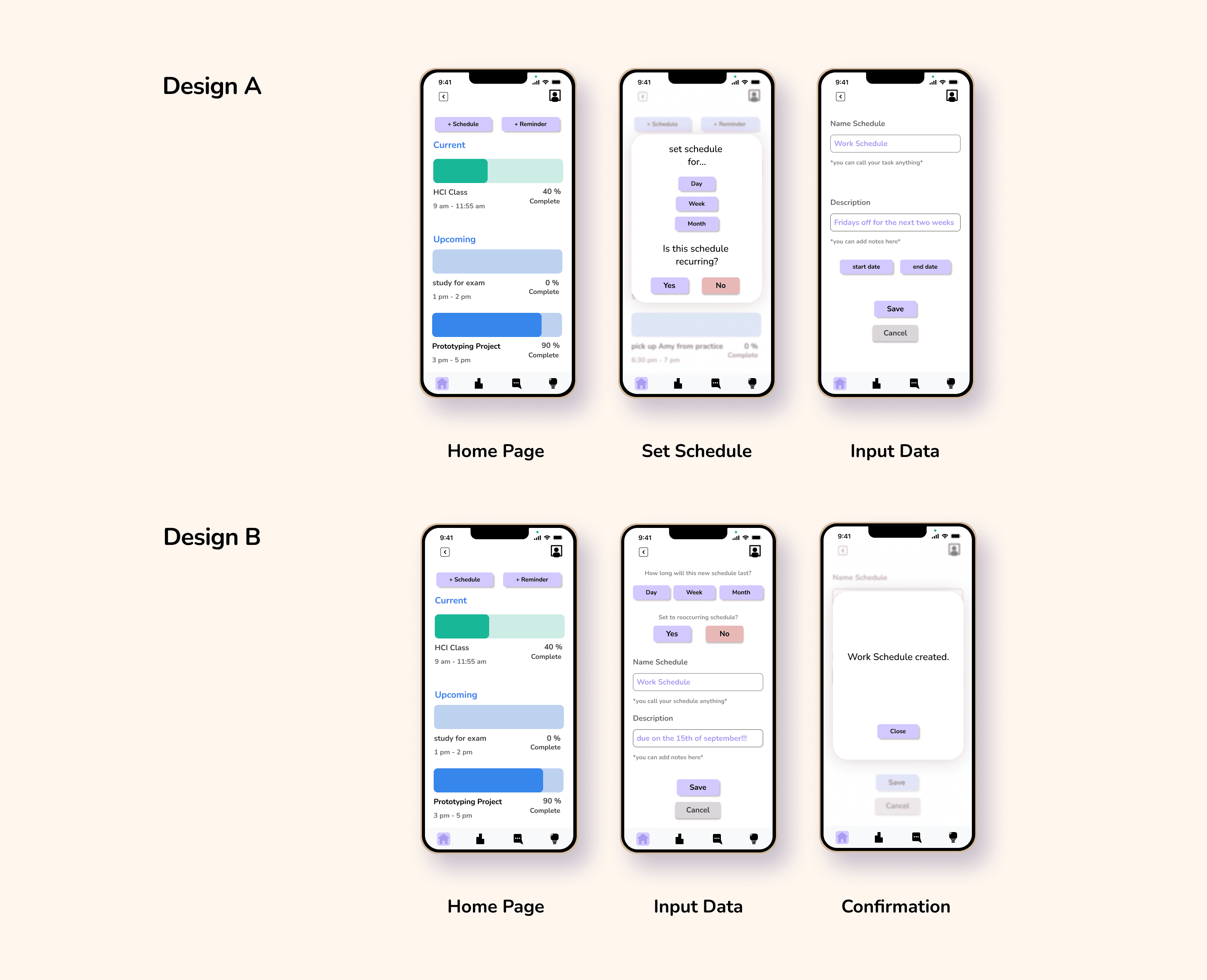
A/B Testing
We tested two task creation flows—one linear, one summary-style—to determine user preferences.
The test confirmed that simplicity and predictability trumped speed when it came to form design.
Building the Blueprint
Turning insights into structure through low-fidelity flows and prototypes
User Flow
We sketched low-fidelity wireframes to represent our key user flows, iterating quickly to test layout and hierarchy.
This early phase let us test ideas without overcommitting.
Components
e designed icons, placeholders, and UI elements to create a clean visual language with high contrast and plenty of white space.
Prioritizing simplicity in our components aligned with our users' frustrations around clutter.
A/B Testing
We tested two task creation flows—one linear, one summary-style—to determine user preferences.
The test confirmed that simplicity and predictability trumped speed when it came to form design.
From Good to Great
What would I do differently now that I’ve grown as a designer?
Growth Through Doing
Empathy First
I would interview more users and explore published studies to back up design choices.
More Ideas, More Magic
I’d do more structured ideation like Crazy 8’s to stretch creativity.
Function Over Flash
At the time, I focused on aesthetics, but now I prioritize usability and interaction design.
Where TimeWise Could Go Next
Design Widgets
Create home screen widgets that reflect time spent, tasks due, and current time bank.
Expand Accessibility
Add features like voice input and screen reader optimization for broader inclusion.
Iterative Testing
Continue refining the app by testing flows and simplifying UX for future updates.
MORE WORK
MORE WORK


