eShop Redesign
Gen Alpha will abandon the Nintendo Switch—but this redesign will stop that from happening.
OVERVIEW
This redesign of the Nintendo Switch eShop focuses on meeting the unique needs of Gen Alpha—digital natives with a demand for instant feedback, intuitive design, and personalized content. The goal was to transform the cluttered, outdated interface into an engaging, AI-driven experience tailored to their expectations and developmental needs.
UI Redesign
My Role
Sole Designer
Year
2024
Tools
Figma

The Challenge
This is the Challenge Statement
Here is more details about the challenge for your reference. I am now talking so much more about it as you can read All the work I’ve done so Far has lead up to this explanation of the challenge. As you keep reading I will go through the process.
The Solution
This is the Solution Statement
Here is more details about the challenge for your reference. I am now talking so much more about it as you can read All the work I’ve done so Far has lead up to this explanation of the challenge. As you keep reading I will go through the process.
Feature 1
This is a description of this feature I’m Highlighting what this feature can do so you know what the app is here for.
Feature 2
This is a description of this feature I’m Highlighting what this feature can do so you know what the app is here for.
Feature 3
This is a description of this feature I’m Highlighting what this feature can do so you know what the app is here for.
The Need
Reaching the Most Digitally Native Generation
How can we make the Nintendo Switch eShop intuitive, fast, and fun for Gen Alpha users?
Gen Alpha are used to instantaneous access, smart systems, and global commerce. The current eShop fails to deliver this by offering a slow, hard-to-navigate shopping experience that ignores personalization and lacks visual feedback.

The Upgrade
AI Meets Play
Create an intuitive, touch-friendly eShop interface that uses AIoT and voice assistants to help Gen Alpha users like Ethan find and buy games with ease.
The new eShop introduces a visual budgeting bar, drag-and-drop interaction, and AI-driven game recommendations based on user interests. It's fun, fast, and designed to build both joy and digital financial literacy.

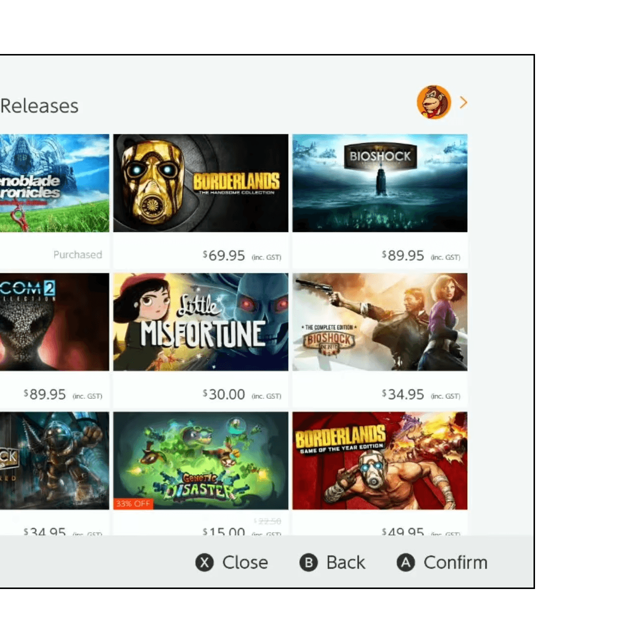
Visual Budget Bar
See spending in real time as you add games to your bar—just like a cart in a store.
AI-Powered Recommendations
Luigi, your voice assistant, curates games based on your hobbies and previous preferences.

Drag-and-Drop Interface
Users can touch and move games across the screen and drop them into a budget bar; ideal for younger users who prefer play over clicks.
The Need
Reaching the Most Digitally Native Generation
How can we make the Nintendo Switch eShop intuitive, fast, and fun for Gen Alpha users?
Gen Alpha are used to instantaneous access, smart systems, and global commerce. The current eShop fails to deliver this by offering a slow, hard-to-navigate shopping experience that ignores personalization and lacks visual feedback.
The Upgrade
AI Meets Play
Create an intuitive, touch-friendly eShop interface that uses AIoT and voice assistants to help Gen Alpha users like Ethan find and buy games with ease.
The new eShop introduces a visual budgeting bar, drag-and-drop interaction, and AI-driven game recommendations based on user interests. It's fun, fast, and designed to build both joy and digital financial literacy.
Visual Budget Bar
See spending in real time as you add games to your bar—just like a cart in a store.
AI-Powered Recommendations
Luigi, your voice assistant, curates games based on your hobbies and previous preferences.
Drag-and-Drop Interface
Users can touch and move games across the screen and drop them into a budget bar; ideal for younger users who prefer play over clicks.
The Challenge
This is the Challenge Statement
Here is more details about the challenge for your reference. I am now talking so much more about it as you can read All the work I’ve done so Far has lead up to this explanation of the challenge. As you keep reading I will go through the process.
The Solution
This is the Solution Statement
Here is more details about the challenge for your reference. I am now talking so much more about it as you can read All the work I’ve done so Far has lead up to this explanation of the challenge. As you keep reading I will go through the process.
Feature 1
This is a description of this feature I’m Highlighting what this feature can do so you know what the app is here for.
Feature 2
This is a description of this feature I’m Highlighting what this feature can do so you know what the app is here for.
Feature 3
This is a description of this feature I’m Highlighting what this feature can do so you know what the app is here for.
The Need
Reaching the Most Digitally Native Generation
How can we make the Nintendo Switch eShop intuitive, fast, and fun for Gen Alpha users?
Gen Alpha are used to instantaneous access, smart systems, and global commerce. The current eShop fails to deliver this by offering a slow, hard-to-navigate shopping experience that ignores personalization and lacks visual feedback.
The Upgrade
AI Meets Play
Create an intuitive, touch-friendly eShop interface that uses AIoT and voice assistants to help Gen Alpha users like Ethan find and buy games with ease.
The new eShop introduces a visual budgeting bar, drag-and-drop interaction, and AI-driven game recommendations based on user interests. It's fun, fast, and designed to build both joy and digital financial literacy.
Visual Budget Bar
See spending in real time as you add games to your bar—just like a cart in a store.
AI-Powered Recommendations
Luigi, your voice assistant, curates games based on your hobbies and previous preferences.
Drag-and-Drop Interface
Users can touch and move games across the screen and drop them into a budget bar; ideal for younger users who prefer play over clicks.
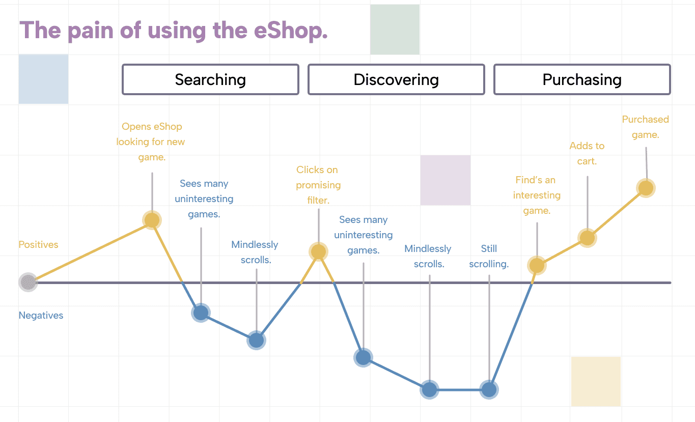
From Scroll to Swipe
Creating an experience that matches the instinctual behaviours of a touch-first generation
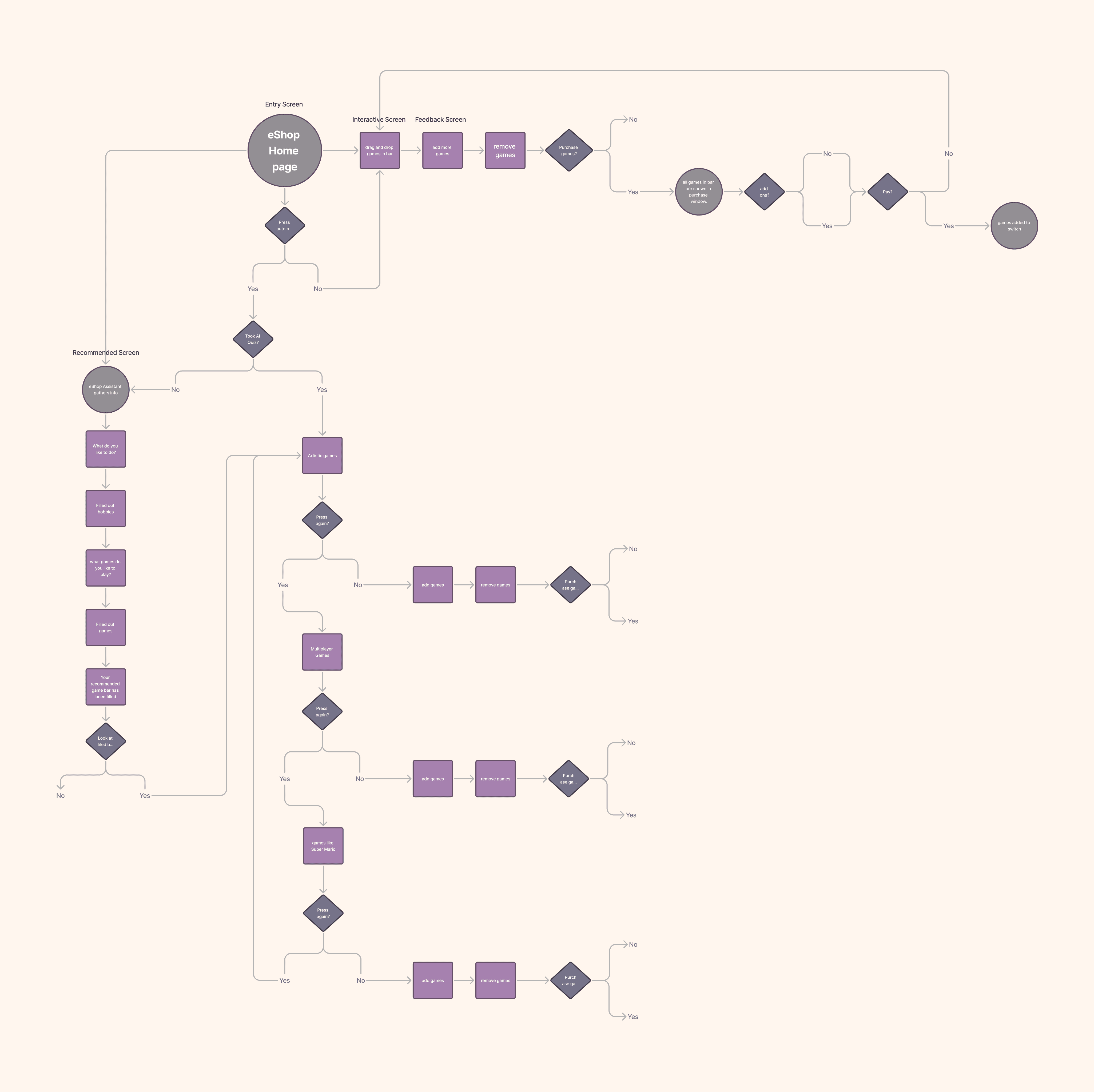
Intuitive Exploration
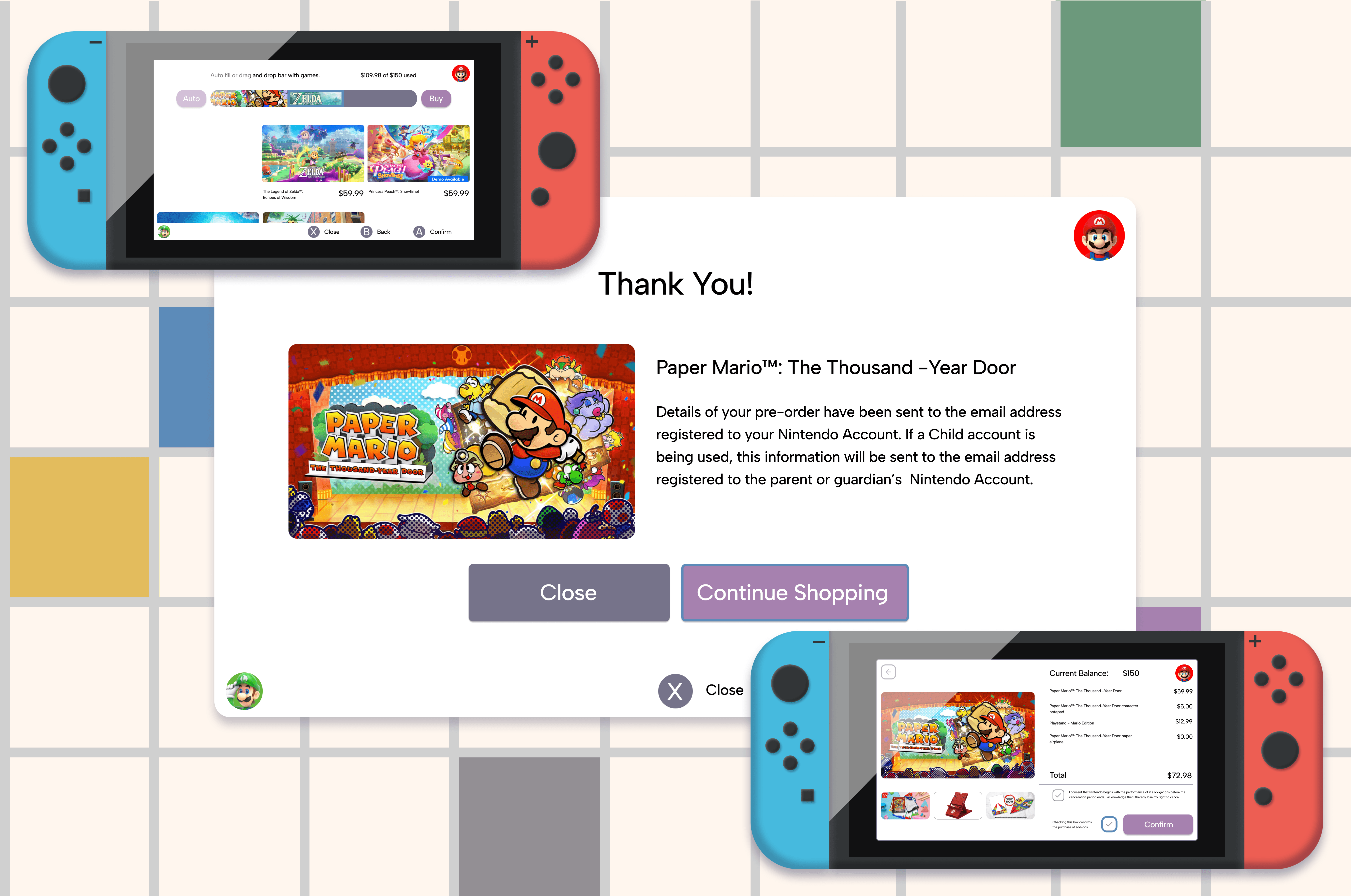
The entry screen provides three clear paths to game discovery: voice, auto-fill, or drag-and-drop—all leading to a balanced, personalized cart.

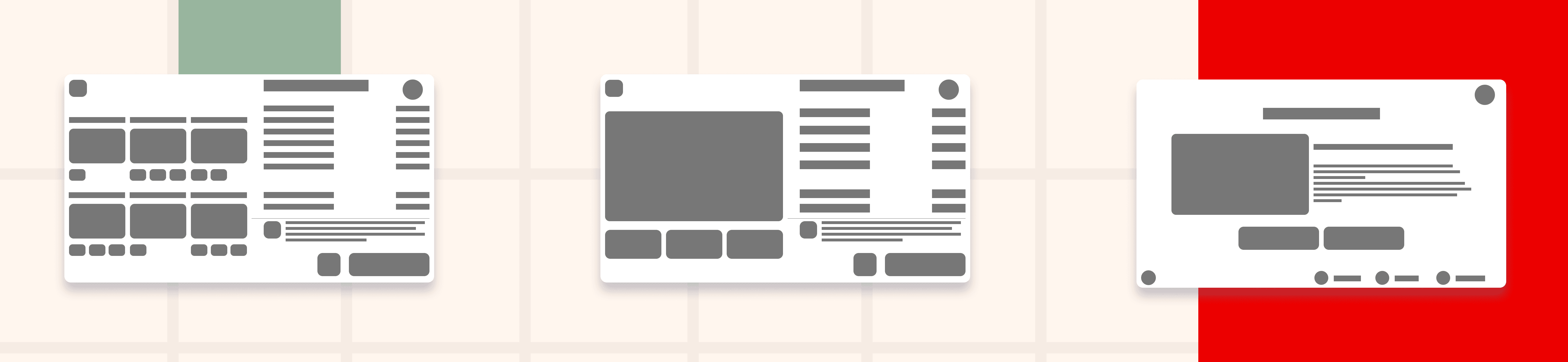
Wireframes
We used Figma to quickly build shape-based wireframes that mapped out key user flows.
Branding
The UI uses soft muted colors, clean sans-serif typography, and gentle contrasts to create a welcoming atmosphere that supports readability and intuitive navigation.

Components
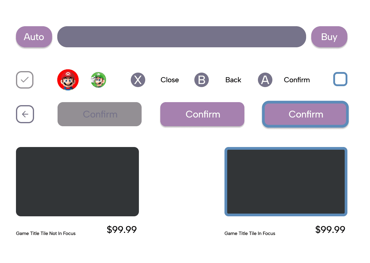
Drag handles, game tiles, expandable pricing bar, and voice input buttons were designed as reusable components with clear roles.
Usability Test
What Worked
Hypothetical tests assumed that drag-and-drop and visual budgeting would appeal to children’s learning instincts.
Needs Work
Voice guidance would benefit from an onboarding sequence.
Questions
Should budget bars reflect real money or abstract values for teaching?
Ideas
Add parent filters and value-based game categories to encourage guided choices.
Design Constraints: Time-Bound Development
This was a course project completed under tight deadlines, so iterations were limited and focus remained on one core solution.

Design Constraints: No User Testing
Due to the nature of the assignment, we couldn't test with real Gen Alpha users; but future testing is outlined in the next steps.
Design Constraints: Lack of Formal Critique
As the project wasn’t presented in class, no direct peer or instructor feedback was received; decisions were made based on research and personal judgment.

A Shop That Feels Like Play


Drag and Drop Shopping
Users drag games into the bar and watch their budget shrink and grow with each selection.

Talk to Luigi
A voice-based interaction system builds trust, personality, and smart recommendations.

Personalized Auto-Fill
One tap fills your bar with curated games based on hobbies and spending limits.

Play This Prototype
From Scroll to Swipe
Creating an experience that matches the instinctual behaviours of a touch-first generation
Intuitive Exploration
The entry screen provides three clear paths to game discovery: voice, auto-fill, or drag-and-drop—all leading to a balanced, personalized cart.
Wireframes
We used Figma to quickly build shape-based wireframes that mapped out key user flows.
Branding
The UI uses soft muted colors, clean sans-serif typography, and gentle contrasts to create a welcoming atmosphere that supports readability and intuitive navigation.
Components
Drag handles, game tiles, expandable pricing bar, and voice input buttons were designed as reusable components with clear roles.
Usability Test
What Worked
Hypothetical tests assumed that drag-and-drop and visual budgeting would appeal to children’s learning instincts.
Needs Work
Voice guidance would benefit from an onboarding sequence.
Questions
Should budget bars reflect real money or abstract values for teaching?
Ideas
Add parent filters and value-based game categories to encourage guided choices.
Design Constraints: Time-Bound Development
This was a course project completed under tight deadlines, so iterations were limited and focus remained on one core solution.
Design Constraints: No User Testing
Due to the nature of the assignment, we couldn't test with real Gen Alpha users; but future testing is outlined in the next steps.
Design Constraints: Lack of Formal Critique
As the project wasn’t presented in class, no direct peer or instructor feedback was received; decisions were made based on research and personal judgment.
A Shop That Feels Like Play
Drag and Drop Shopping
Users drag games into the bar and watch their budget shrink and grow with each selection.
Talk to Luigi
A voice-based interaction system builds trust, personality, and smart recommendations.
Personalized Auto-Fill
One tap fills your bar with curated games based on hobbies and spending limits.
Play This Prototype
Understanding the Alpha Mindset
What does a generation raised on instant access expect from their shopping experience?
Instant Access is the Standard

Gen Alpha doesn’t scroll; they explore. Waiting is friction, and cluttered menus are frustration. The current eShop design doesn’t align with their expectations.
How can we redesign a digital store that aligns with Gen Alpha’s expectations for speed, personalization, and play?
Literature Review
We reviewed articles on Gen Alpha behaviors, values, and shopping habits, including works by Kaplan and Watts.
These helped frame the eShop not as a product browser, but a personalised discovery tool.
Persona-Driven Design
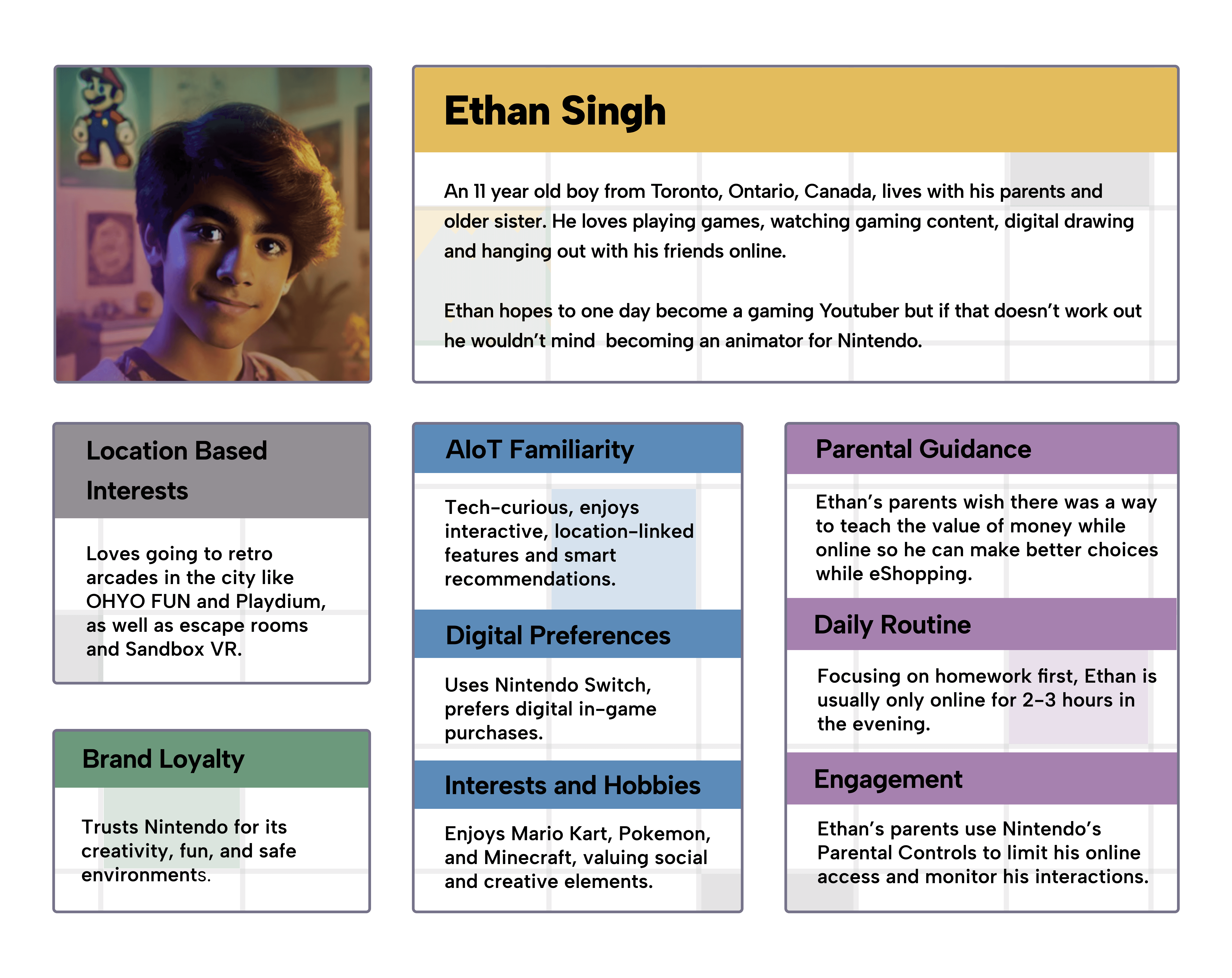
Our professor provided Ethan Singh; a tech-savvy, artistic 11-year-old—as our Gen Alpha persona.
Ethan gave us focus and context. His habits shaped our UX decisions.
UX Analysis of Current eShop
We examined the existing interface for clarity, speed, and navigation challenges.
It became clear that the eShop needed more than a facelift. It needed a conceptual redesign.

Understanding the Alpha Mindset
What does a generation raised on instant access expect from their shopping experience?
Instant Access is the Standard
Gen Alpha doesn’t scroll; they explore. Waiting is friction, and cluttered menus are frustration. The current eShop design doesn’t align with their expectations.
How can we redesign a digital store that aligns with Gen Alpha’s expectations for speed, personalization, and play?
Literature Review
We reviewed articles on Gen Alpha behaviors, values, and shopping habits, including works by Kaplan and Watts.
These helped frame the eShop not as a product browser, but a personalised discovery tool.
Persona-Driven Design
Our professor provided Ethan Singh; a tech-savvy, artistic 11-year-old—as our Gen Alpha persona.
Ethan gave us focus and context. His habits shaped our UX decisions.
UX Analysis of Current eShop
We examined the existing interface for clarity, speed, and navigation challenges.
It became clear that the eShop needed more than a facelift. It needed a conceptual redesign.
01.Research Phase Title
Research Question goes here what are you trying to uncover?
Main discovery title
This is a description of the discovery. It explains the key finding and what lead to the discovery. This should only be a few lines don’t make it too heavy and full of text you just want to matter of factly explain what it is. It is nice to describe statistics here and pair with an infographic of the stat.
Now that we’ve discovered this main thing we now have a new question that seeks to understand how users feel about this discovery.
Empathizing: Activity 1
This is a description of the first activity that was done to discover the user needs. Talk about what you did.
This is where you reflect on what you discovered and describe something interesting that you figured out during the process.
Empathizing: Activity 2
This is a description of the first activity that was done to discover the user needs. Talk about what you did.
This is where you reflect on what you discovered and describe something interesting that you figured out during the process.
Empathizing: Activity 3
This is a description of the first activity that was done to discover the user needs. Talk about what you did.
This is where you reflect on what you discovered and describe something interesting that you figured out during the process.
Understanding the Alpha Mindset
What does a generation raised on instant access expect from their shopping experience?
Instant Access is the Standard
Gen Alpha doesn’t scroll; they explore. Waiting is friction, and cluttered menus are frustration. The current eShop design doesn’t align with their expectations.
How can we redesign a digital store that aligns with Gen Alpha’s expectations for speed, personalization, and play?
Literature Review
We reviewed articles on Gen Alpha behaviors, values, and shopping habits, including works by Kaplan and Watts.
These helped frame the eShop not as a product browser, but a personalised discovery tool.
Persona-Driven Design
Our professor provided Ethan Singh; a tech-savvy, artistic 11-year-old—as our Gen Alpha persona.
Having specific goals allowed for more focused ideation.
UX Analysis of Current eShop
Since the Nintendo Switch is both touch and button-based, we made sure the interface was intuitive for both interaction types.
Accessibility was considered, even if not the main focus, ensuring the UI was usable for kids with different preferences or needs.
01.Research Phase Title
Research Question goes here what are you trying to uncover?
Main discovery title
This is a description of the discovery. It explains the key finding and what lead to the discovery. This should only be a few lines don’t make it too heavy and full of text you just want to matter of factly explain what it is. It is nice to describe statistics here and pair with an infographic of the stat.
Now that we’ve discovered this main thing we now have a new question that seeks to understand how users feel about this discovery.
Empathizing: Activity 1
This is a description of the first activity that was done to discover the user needs. Talk about what you did.
This is where you reflect on what you discovered and describe something interesting that you figured out during the process.
Empathizing: Activity 2
This is a description of the first activity that was done to discover the user needs. Talk about what you did.
This is where you reflect on what you discovered and describe something interesting that you figured out during the process.
Empathizing: Activity 3
This is a description of the first activity that was done to discover the user needs. Talk about what you did.
This is where you reflect on what you discovered and describe something interesting that you figured out during the process.
Understanding the Alpha Mindset
What does a generation raised on instant access expect from their shopping experience?
Instant Access is the Standard
Gen Alpha doesn’t scroll; they explore. Waiting is friction, and cluttered menus are frustration. The current eShop design doesn’t align with their expectations.
How can we redesign a digital store that aligns with Gen Alpha’s expectations for speed, personalization, and play?
Literature Review
We reviewed articles on Gen Alpha behaviors, values, and shopping habits, including works by Kaplan and Watts.
These helped frame the eShop not as a product browser, but a personalised discovery tool.
Persona-Driven Design
Our professor provided Ethan Singh; a tech-savvy, artistic 11-year-old—as our Gen Alpha persona.
Ethan gave us focus and context. His habits shaped our UX decisions.
UX Analysis of Current eShop
We examined the existing interface for clarity, speed, and navigation challenges.
It became clear that the eShop needed more than a facelift. It needed a conceptual redesign.
01.Research Phase Title
Research Question goes here what are you trying to uncover?
Main discovery title
This is a description of the discovery. It explains the key finding and what lead to the discovery. This should only be a few lines don’t make it too heavy and full of text you just want to matter of factly explain what it is. It is nice to describe statistics here and pair with an infographic of the stat.
Now that we’ve discovered this main thing we now have a new question that seeks to understand how users feel about this discovery.
Empathizing: Activity 1
This is a description of the first activity that was done to discover the user needs. Talk about what you did.
This is where you reflect on what you discovered and describe something interesting that you figured out during the process.
Empathizing: Activity 2
This is a description of the first activity that was done to discover the user needs. Talk about what you did.
This is where you reflect on what you discovered and describe something interesting that you figured out during the process.
Empathizing: Activity 3
This is a description of the first activity that was done to discover the user needs. Talk about what you did.
This is where you reflect on what you discovered and describe something interesting that you figured out during the process.
Understanding the Alpha Mindset
What does a generation raised on instant access expect from their shopping experience?
Instant Access is the Standard
Gen Alpha doesn’t scroll; they explore. Waiting is friction, and cluttered menus are frustration. The current eShop design doesn’t align with their expectations.
How can we redesign a digital store that aligns with Gen Alpha’s expectations for speed, personalization, and play?
Literature Review
We reviewed articles on Gen Alpha behaviors, values, and shopping habits, including works by Kaplan and Watts.
These helped frame the eShop not as a product browser, but a personalised discovery tool.
Persona-Driven Design
Our professor provided Ethan Singh; a tech-savvy, artistic 11-year-old—as our Gen Alpha persona.
Ethan gave us focus and context. His habits shaped our UX decisions.
UX Analysis of Current eShop
Since the Nintendo Switch is both touch and button-based, we made sure the interface was intuitive for both interaction types.
Accessibility was considered, even if not the main focus, ensuring the UI was usable for kids with different preferences or needs.
01.Research Phase Title
Research Question goes here what are you trying to uncover?
Main discovery title
This is a description of the discovery. It explains the key finding and what lead to the discovery. This should only be a few lines don’t make it too heavy and full of text you just want to matter of factly explain what it is. It is nice to describe statistics here and pair with an infographic of the stat.
Now that we’ve discovered this main thing we now have a new question that seeks to understand how users feel about this discovery.
Empathizing: Activity 1
This is a description of the first activity that was done to discover the user needs. Talk about what you did.
This is where you reflect on what you discovered and describe something interesting that you figured out during the process.
Empathizing: Activity 2
This is a description of the first activity that was done to discover the user needs. Talk about what you did.
This is where you reflect on what you discovered and describe something interesting that you figured out during the process.
Empathizing: Activity 3
This is a description of the first activity that was done to discover the user needs. Talk about what you did.
This is where you reflect on what you discovered and describe something interesting that you figured out during the process.
Understanding the Alpha Mindset
What does a generation raised on instant access expect from their shopping experience?
Instant Access is the Standard
Gen Alpha doesn’t scroll; they explore. Waiting is friction, and cluttered menus are frustration. The current eShop design doesn’t align with their expectations.
How can we redesign a digital store that aligns with Gen Alpha’s expectations for speed, personalization, and play?
Literature Review
We reviewed articles on Gen Alpha behaviors, values, and shopping habits, including works by Kaplan and Watts.
These helped frame the eShop not as a product browser, but a personalised discovery tool.
Persona-Driven Design
Our professor provided Ethan Singh; a tech-savvy, artistic 11-year-old—as our Gen Alpha persona.
Ethan gave us focus and context. His habits shaped our UX decisions.
UX Analysis of Current eShop
We examined the existing interface for clarity, speed, and navigation challenges.
It became clear that the eShop needed more than a facelift. It needed a conceptual redesign.
02.Define Phase Title
Define phase subheading to encapsulate the meaning of the phase.
Defining : Activity 1
This is a description of the first activity that was done to define the user problems. Talk about what you did.
This is where you reflect on what you discovered and describe something interesting that you figured out during the process.
Defining : Activity 2
This is a description of the first activity that was done to define the user problems. Talk about what you did.
This is where you reflect on what you discovered and describe something interesting that you figured out during the process.
Defining : Activity 1
This is a description of the first activity that was done to define the user problems. Talk about what you did.
This is where you reflect on what you discovered and describe something interesting that you figured out during the process.
KEY INSIGHTS
How might we statement goes here.
Designing for Digital Natives
Clarifying needs and translating them into actionable solutions
Identifying Pain Points
We mapped issues from the current eShop including low findability, lack of user feedback, and visual clutter.
These insights grounded our design in real user frustrations.
Translating Needs Into UX Goals
We aligned Ethan’s needs with UX goals: visual feedback, voice interaction, and faster discovery.

Having specific goals allowed for more focused ideation.
Designing for Touch and Controller
Since the Nintendo Switch is both touch and button-based, we made sure the interface was intuitive for both interaction types.
Accessibility was considered, even if not the main focus, ensuring the UI was usable for kids with different preferences or needs.
Less Clicks, More Play
How might we help Gen Alpha discover games through play—not menus?
02.Define Phase Title
Define phase subheading to encapsulate the meaning of the phase.
Defining : Activity 1
This is a description of the first activity that was done to define the user problems. Talk about what you did.
This is where you reflect on what you discovered and describe something interesting that you figured out during the process.
Defining : Activity 2
This is a description of the first activity that was done to define the user problems. Talk about what you did.
This is where you reflect on what you discovered and describe something interesting that you figured out during the process.
Defining : Activity 1
This is a description of the first activity that was done to define the user problems. Talk about what you did.
This is where you reflect on what you discovered and describe something interesting that you figured out during the process.
KEY INSIGHTS
How might we statement goes here.
Designing for Digital Natives
Clarifying needs and translating them into actionable solutions
Identifying Pain Points
We mapped issues from the current eShop including low findability, lack of user feedback, and visual clutter.
These insights grounded our design in real user frustrations.
Translating Needs Into UX Goals
We aligned Ethan’s needs with UX goals: visual feedback, voice interaction, and faster discovery.
Having specific goals allowed for more focused ideation.
Designing for Touch and Controller
Since the Nintendo Switch is both touch and button-based, we made sure the interface was intuitive for both interaction types.
Accessibility was considered, even if not the main focus, ensuring the UI was usable for kids with different preferences or needs.
Less Clicks, More Play
How might we help Gen Alpha discover games through play—not menus?
Designing for Digital Natives
Clarifying needs and translating them into actionable solutions
Identifying Pain Points
We mapped issues from the current eShop including low findability, lack of user feedback, and visual clutter.
These helped frame the eShop not as a product browser, but a personalised discovery tool.
Translating Needs Into UX Goals
We aligned Ethan’s needs with UX goals: visual feedback, voice interaction, and faster discovery.
Having specific goals allowed for more focused ideation.
Designing for Touch and Controller
Since the Nintendo Switch is both touch and button-based, we made sure the interface was intuitive for both interaction types.
Accessibility was considered, even if not the main focus, ensuring the UI was usable for kids with different preferences or needs.
Less Clicks, More Play
How might we help Gen Alpha discover games through play—not menus?
Designing for Digital Natives
Clarifying needs and translating them into actionable solutions
Identifying Pain Points
We mapped issues from the current eShop including low findability, lack of user feedback, and visual clutter.
These insights grounded our design in real user frustrations.
Translating Needs Into UX Goals
We aligned Ethan’s needs with UX goals: visual feedback, voice interaction, and faster discovery.
Having specific goals allowed for more focused ideation.
Designing for Touch and Controller
Since the Nintendo Switch is both touch and button-based, we made sure the interface was intuitive for both interaction types.
Accessibility was considered, even if not the main focus, ensuring the UI was usable for kids with different preferences or needs.
Less Clicks, More Play
How might we help Gen Alpha discover games through play—not menus?
Designing for Digital Natives
Clarifying needs and translating them into actionable solutions
Identifying Pain Points
We reviewed articles on Gen Alpha behaviors, values, and shopping habits, including works by Kaplan and Watts.
These insights grounded our design in real user frustrations.
Translating Needs Into UX Goals
We aligned Ethan’s needs with UX goals: visual feedback, voice interaction, and faster discovery.
Having specific goals allowed for more focused ideation.
Designing for Touch and Controller
Since the Nintendo Switch is both touch and button-based, we made sure the interface was intuitive for both interaction types.
Accessibility was considered, even if not the main focus, ensuring the UI was usable for kids with different preferences or needs.
Less Clicks, More Play
How might we help Gen Alpha discover games through play—not menus?
Designing for Digital Natives
Clarifying needs and translating them into actionable solutions
Identifying Pain Points
We mapped issues from the current eShop including low findability, lack of user feedback, and visual clutter.
These insights grounded our design in real user frustrations.
Translating Needs Into UX Goals
We aligned Ethan’s needs with UX goals: visual feedback, voice interaction, and faster discovery.
We aligned Ethan’s needs with UX goals: visual feedback, voice interaction, and faster discovery.
Designing for Touch and Controller
Since the Nintendo Switch is both touch and button-based, we made sure the interface was intuitive for both interaction types.
Accessibility was considered, even if not the main focus, ensuring the UI was usable for kids with different preferences or needs.
Less Clicks, More Play
How might we help Gen Alpha discover games through play—not menus?
Designing for Digital Natives
Clarifying needs and translating them into actionable solutions
Identifying Pain Points
We mapped issues from the current eShop including low findability, lack of user feedback, and visual clutter.
These insights grounded our design in real user frustrations.
Translating Needs Into UX Goals
We aligned Ethan’s needs with UX goals: visual feedback, voice interaction, and faster discovery.
Having specific goals allowed for more focused ideation.
Designing for Touch and Controller
Since the Nintendo Switch is both touch and button-based, we made sure the interface was intuitive for both interaction types.
Accessibility was considered, even if not the main focus, ensuring the UI was usable for kids with different preferences or needs.
Less Clicks, More Play
How might we help Gen Alpha discover games through play—not menus?
Designing the Digital Playground
Building an intuitive and interactive storefront for Ethan and his generation
Figma Mockups
We explored multiple layouts, prioritizing Ethan’s balance bar and game tiles over traditional category systems.
The simplicity of shape-based layouts helped us focus on clarity before style.

Inspiration from Parental Controls
We used a note in Ethan's persona about parental involvement as a springboard to explore a budget-aware design, simulating how real-world spending can be visualized and discussed at home.
Designing for kids means also considering how their parents will interpret and approve of their experience.

Designing with a Single Vision
We committed to a single idea from the start, building out one cohesive design path based on Gen Alpha needs without straying into feature overload.
It was more important to design a tight experience than an over-ambitious one.

Designing the Digital Playground
Building an intuitive and interactive storefront for Ethan and his generation
Figma Mockups
We explored multiple layouts, prioritizing Ethan’s balance bar and game tiles over traditional category systems.
The simplicity of shape-based layouts helped us focus on clarity before style.
Inspiration from Parental Controls
We used a note in Ethan's persona about parental involvement as a springboard to explore a budget-aware design, simulating how real-world spending can be visualized and discussed at home.
Designing for kids means also considering how their parents will interpret and approve of their experience.
Designing with a Single Vision
We committed to a single idea from the start, building out one cohesive design path based on Gen Alpha needs without straying into feature overload.
It was more important to design a tight experience than an over-ambitious one.
Rethinking Play as Learning
How do we build fun-first experiences that teach valuable skills?
Play is the Portal to Learning
Education Through Design
The budget bar has potential beyond shopping—it teaches math and money management.
Personas Are Powerful
Ethan kept us focused, even when feature creep tried to sneak in.
Simplicity Sells
Every feature was cut or redesigned until even an 8-year-old could use it—because that’s who we were designing for.
How to Evolve This Design
Prototype With Real Users
Build a working model and test with actual Gen Alpha participants.
Build Out the Flow
Expand the current prototype with more screens and UI states.
Reuse the Cart Bar
Apply the budget cart concept to other kid-friendly marketplaces like movies or learning tools.
MORE WORK
MORE WORK


